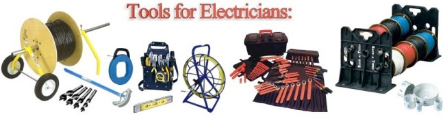
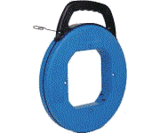
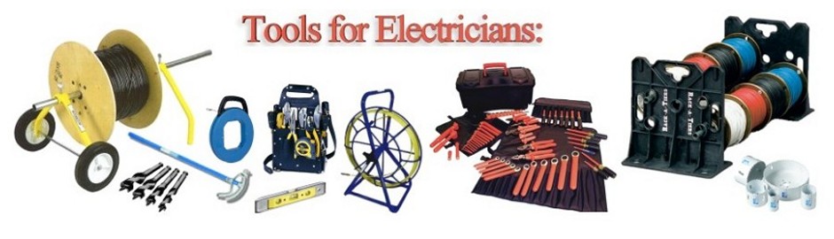
Tools for Electricians, Installers, Maintenance & Service Technicians
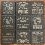
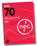
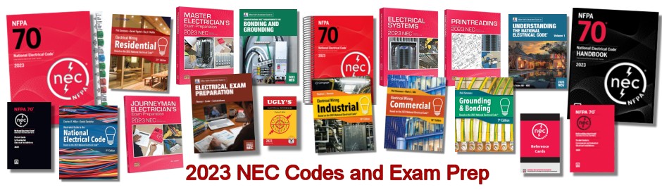
Electricians Slate Coasters * * * * * * * Tools for Electricians * * * * * * * 2023 NEC + Exam Prep Study Guides Now Available!